Add Weather to your IoT Data


If you have a smart factory initiative you likely use sensor data from a historian system like PI from OSISoft. Using that data in a predictive sense can help improve OEE (overall equipment effectiveness: availability; performance; quality). The classic examples are to predict machine faults in order to reduce downtime, and for preventing product quality issues.
Analyzing this voluminous data can be a challenge. There are issues of data integration, transformation, and the selection of appropriate time intervals to use. And machine data can be messy, as discussed here. But once you get far enough past those challenges and begin to reap the rewards of advanced analytics, there is even more success to be had by adding weather data.
In the data science community it is often said that better accuracy results from having better (more) data than from using better algorithms. And it turns out that weather data can incrementally contribute to accuracy in many cases.
That is what we learned on a project where we had sensor data generating about 1300 data points along a very long production line, one of seven lines in this plant. When building models, quite a few of these variables (tags) rose to the top in terms of being predictive of a machine fault. When we added in ambient weather (measurements such as temperature, precipitation, dew point, and atmospheric pressure), we found that four key, straightforward weather measurements rose to the top as well.
The following graphic, from SAS Enterprise Miner, shows a ranking of the (disguised) top variables in terms of contributing to the strength of a predictive model. Four of those (marked with the arrows) were weather related.
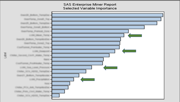
In particular we found that dew point was contributing to one type of problem. This is a food product and it turns out that for one recipe, if the dew point rises above a certain level, the product gets “too puffy” and is unable to fit in its wrapper. When this happens the product is pulled off the line as scrap.
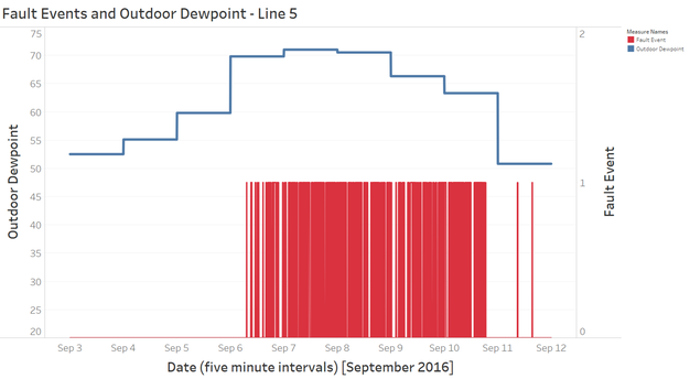
In the following chart this triggering event is shown with the red bars. The data is aggregated to five minute intervals over 12 days. Each occurrence of the red bar indicates that this event was triggered at least once in that five minute interval.
The blue line represents the dew point. You can see that on September 6th the dew point jumped from 60 to 70, and that’s where the trouble began, running for about four days before dropping below 60 again.
Are you looking for better insights and better predictive accuracy to improve OEE? Consider adding weather data as a low cost / high return asset.